 Harvey Fang
Identifying the Opportunity
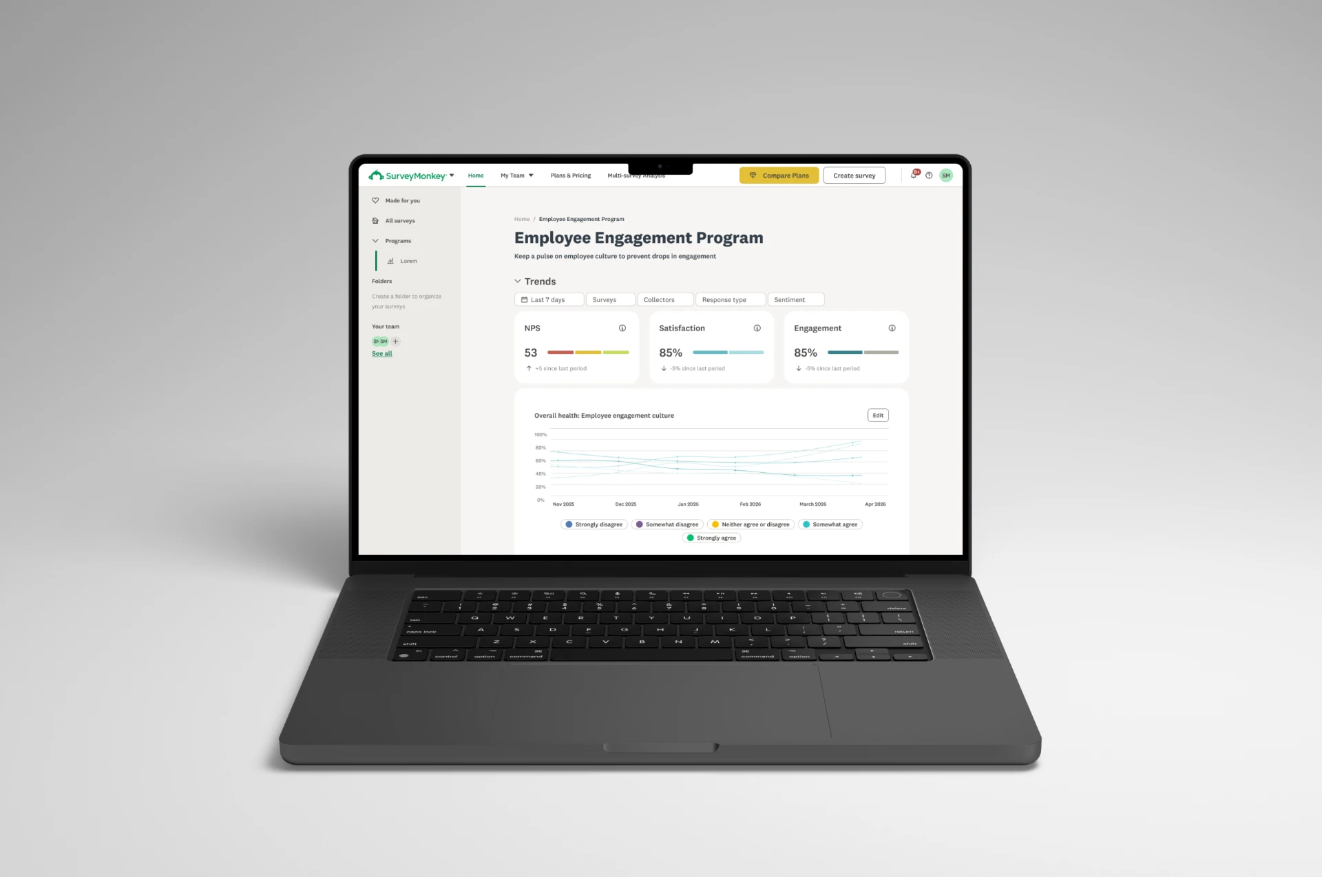
Around the same time, our Brand team was introducing a new visual direction, including an updated color palette and a fresh approach to illustration. We saw an opportunity to bring those elements into the product and create a more cohesive experience across the SurveyMonkey brand.
We wanted to establish clearer visual hierarchy, remove unnecessary noise, and make complex experiences feel more intuitive. Above all, we wanted SurveyMonkey to feel like the powerful platform it had become, while remaining approachable, warm, and a little cheeky.
Exploring the Visual Direction
I worked closely with a contract designer, providing creative direction as we explored a wide range of possibilities. We deliberately started broad, drawing inspiration from competitors, digital products, architecture, print, and physical spaces, as well as familiar SurveyMonkey elements like radio buttons.
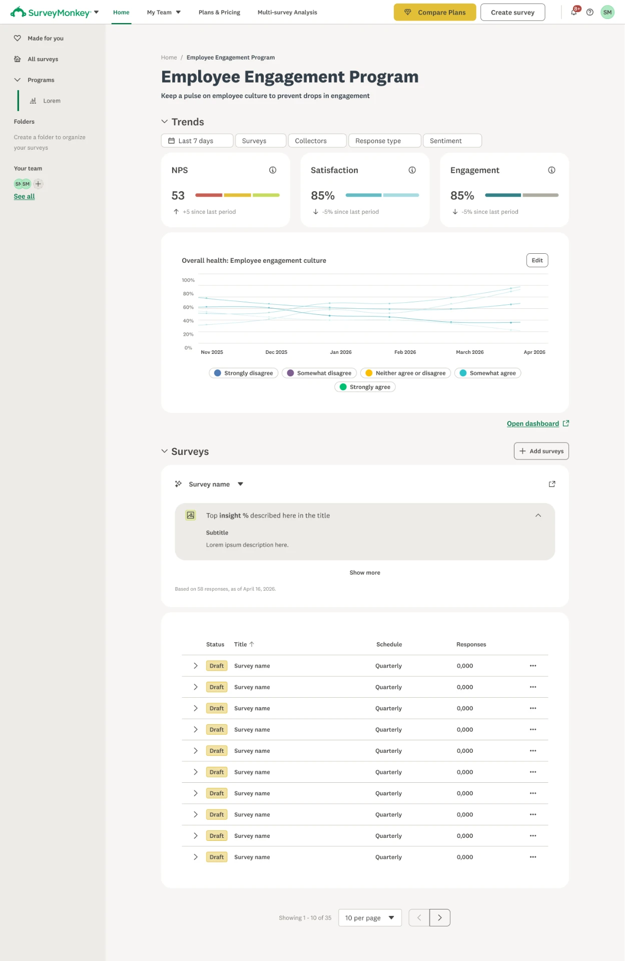
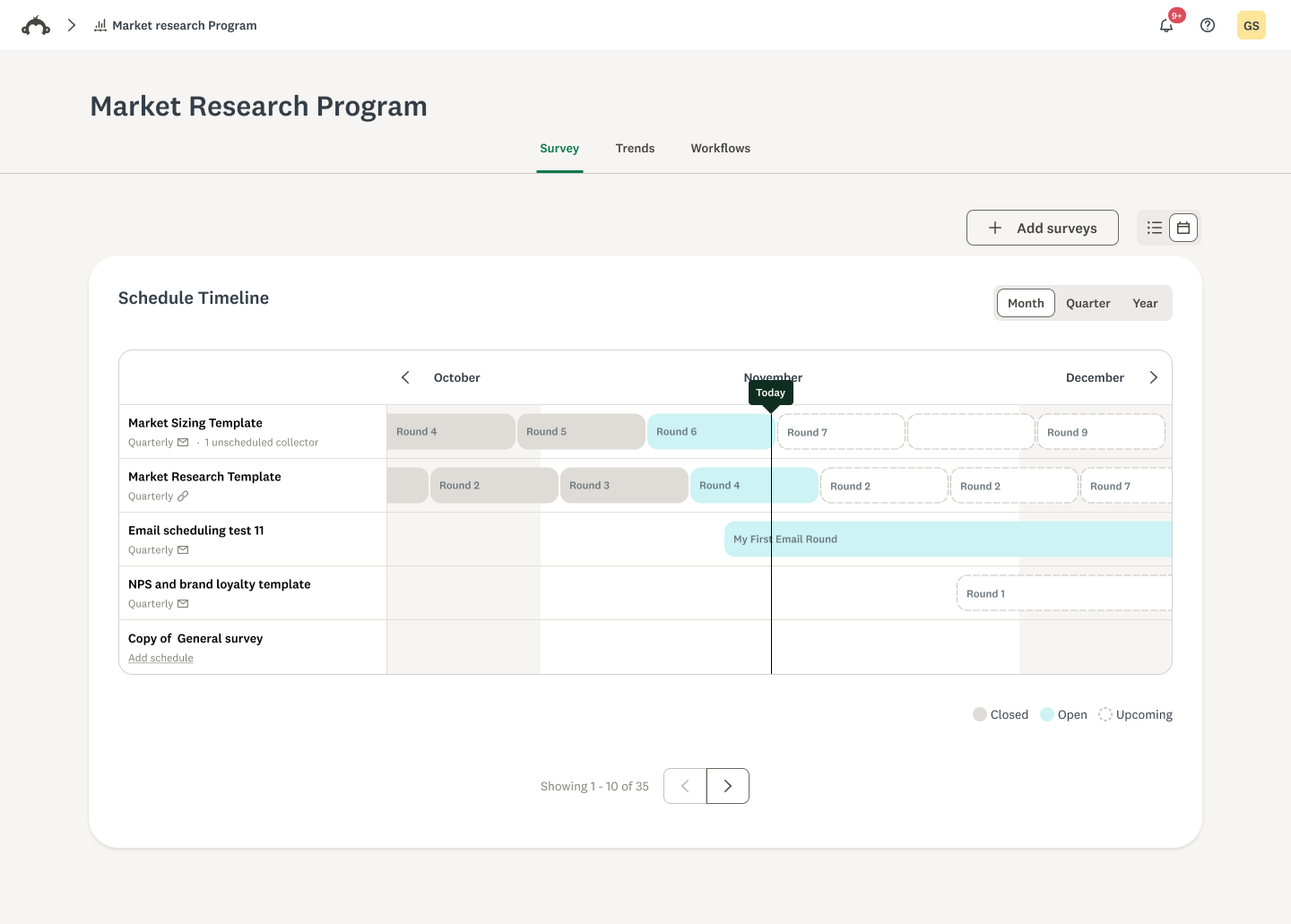
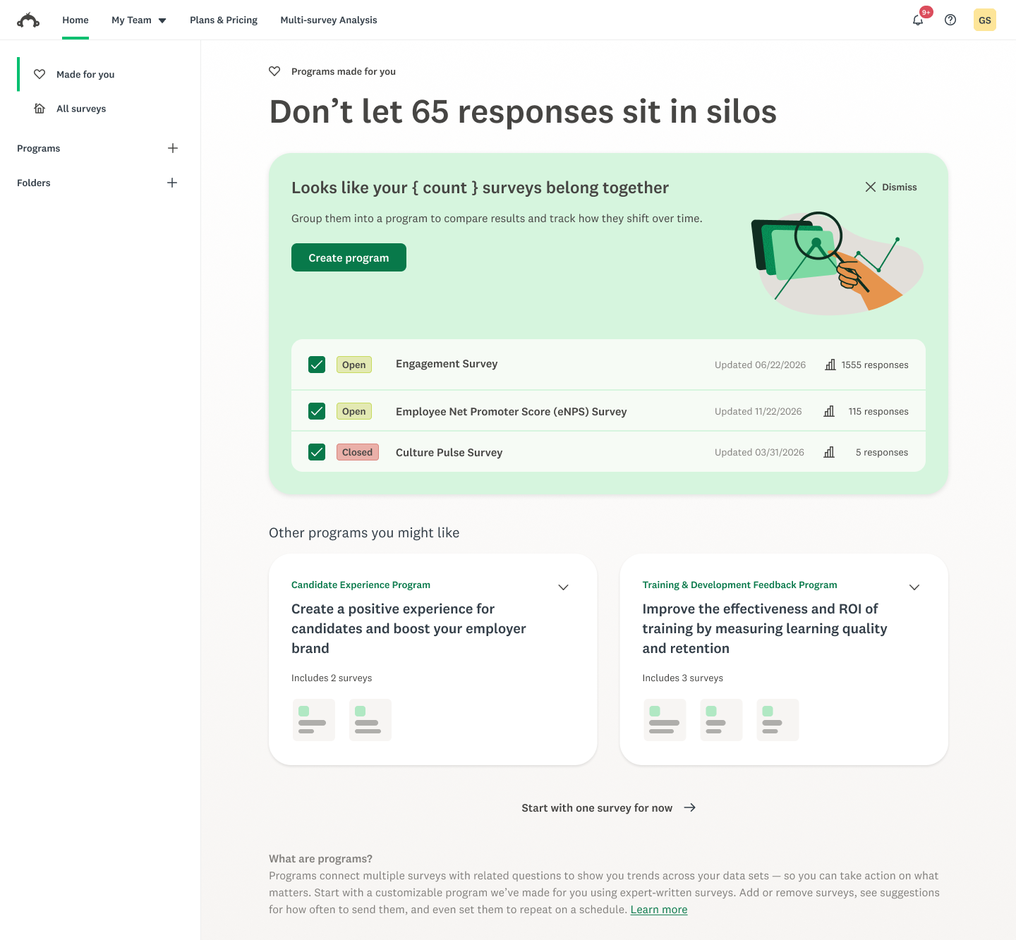
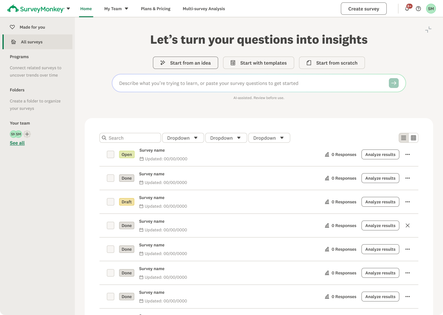
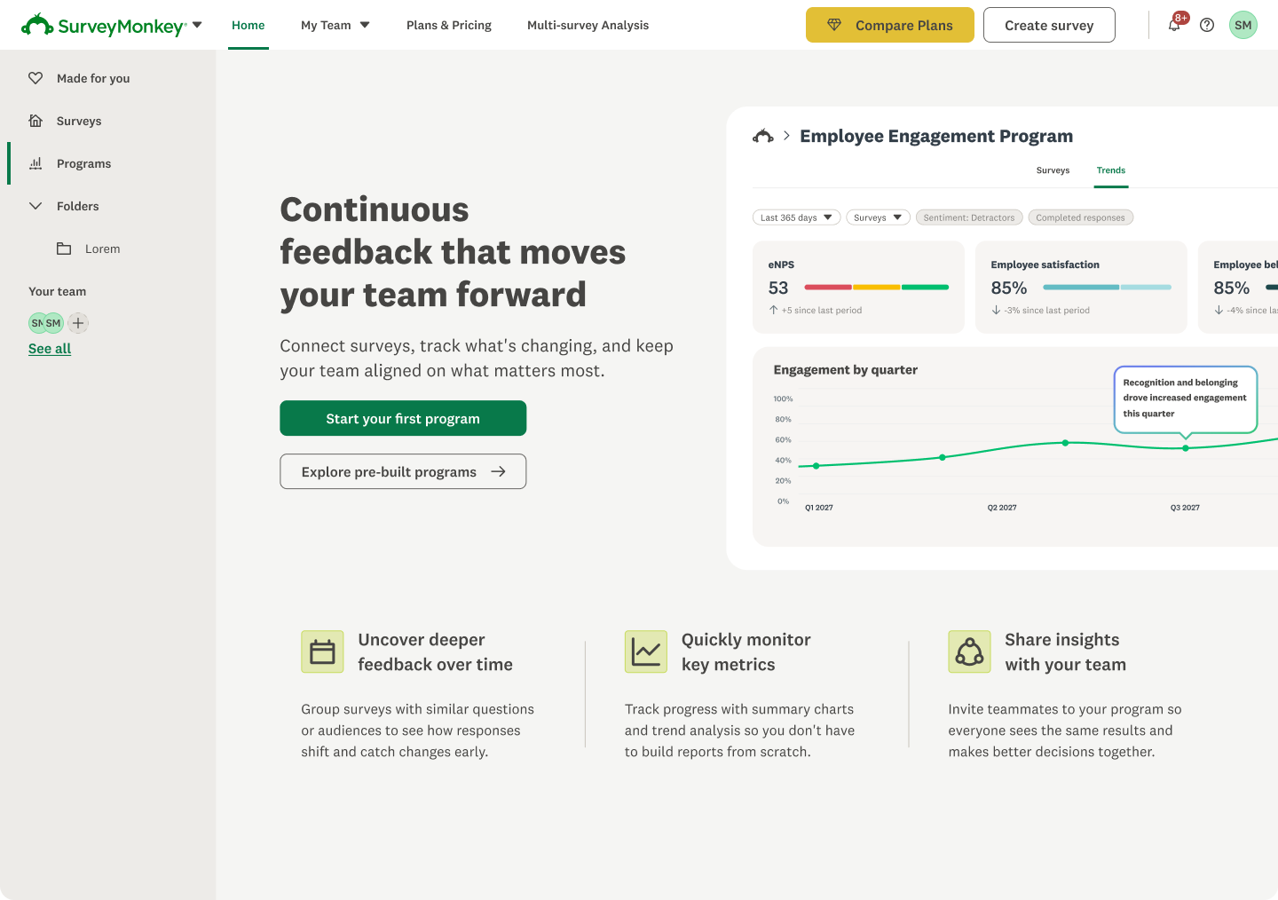
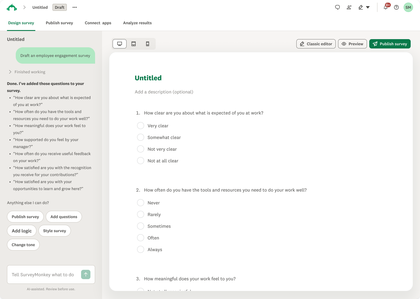
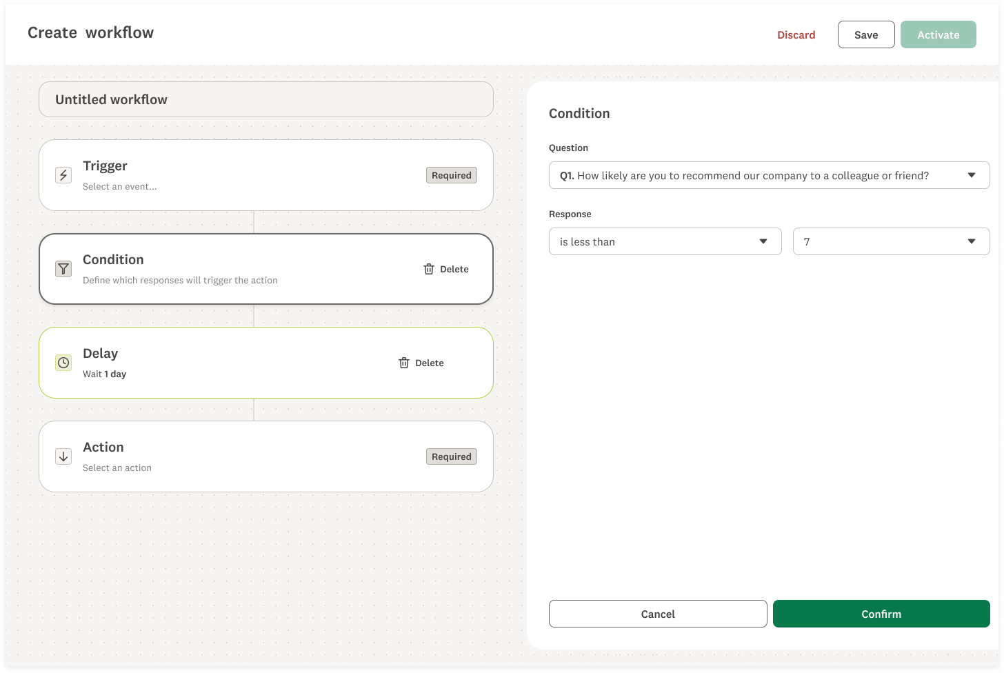
As the direction began to take shape, we narrowed our explorations, identified the strongest ideas, and brought them together into a cohesive visual language. We focused on elements like dot grid patterns, neutral tones, layered cards, and subtle shadows, combining them with Brand's new color palette to create something that felt modern and expressive while still being recognizably SurveyMonkey.
Bringing the Vision Into the Product
With a clearer visual direction in place, we started translating the explorations into actual product experiences. I organized the work into a phased rollout, prioritizing high-traffic pages and key product experiences where the changes would have the greatest visibility and impact.
I also introduced AI-assisted prototyping into our design process, developing custom tools to quickly explore visual variations and apply emerging patterns across different screens. This helped us move faster, evaluate ideas in context, and build alignment around the direction.
Working closely with Product, Brand, and the Design System team, we refined the designs against real product requirements and technical constraints. The goal was to establish a visual direction that could realistically be implemented and extended across the platform.
Building a Foundation for the Design Organization
To bring Catalyst across the product, I worked closely with the Web Design System (WDS) team to update foundational tokens and components, including colors, buttons, cards, and elevation. This allowed us to introduce the new visual language across multiple experiences without redesigning every screen individually.
We partnered with WDS engineers to test and refine components in Storybook, while giving designers the ability to toggle between existing and Catalyst styles in Figma. We also made Catalyst the default visual language in Claude Design, helping accelerate adoption through AI-assisted prototyping.
Beyond the design system, I championed Catalyst across Product, Design, and Engineering, building alignment and encouraging adoption. As the primary point of contact, I was frequently brought into projects to provide creative direction and help teams apply Catalyst consistently across different parts of SurveyMonkey.
Outcomes and Learnings
Catalyst has helped establish a more cohesive visual language across SurveyMonkey, while creating momentum around design system adoption. With Catalyst components now integrated into Figma and Claude Design, WDS adoption has grown from 60% to 72% and climbing, helping improve design consistency across the product.
While the early results are encouraging, there's still more to learn. In Q1, we'll begin qualitative research to understand how customers perceive the refreshed experience, along with measuring engagement metrics to evaluate its impact.
I'm also continuing to lead Catalyst into Phase 2, expanding into additional product experiences, revisiting ideas that didn't make the initial release, and exploring how motion, transitions, and microinteractions can bring more personality and clarity to the product.