Problem
The onboarding experience for Restore 2 had several key issues that created friction early in the user journey. For one, the setup process often took too long, causing abandonment before users even fully understood the product. Even when users completed onboarding, many still felt unclear on how to use Restore 2 and often missed core features entirely, simply because they were not introduced at the right moments or in a way that made it's value obvious. All of this pointed to a need for a more focused, goal-oriented onboarding that made the product feel both intuitive and valuable from the start.
Defining the Journey
To hone in on the right onboarding journey for our users, I started by mapping the complete user experience from the moment they purchased their Restore, through setup, first use, and onward through daily engagement. This journey map allowed us to visualize the entire lifecycle across both the physical device and the app experience.
It became a critical tool as it helped align multiple cross-functional teams including design, product, engineering, and marketing. It also uncovered pain points, gaps, and opportunities where the entire Restore experience could collectively deliver value and build confidence across multiple touch points.

Benchmarking and Data
To better understand the landscape, I reviewed dozens of onboarding flows from other iOT products. I physically tested many of them and spent time analyzing user reviews, teardown videos, and setup guides.
In parallel, I worked with both our research and data teams to review feedback and support tickets from Restore 2. A few patterns became clear: Onboarding was often far too long and some steps created more confusion than they helped. Most importantly, users were not always sure what Restore could actually do for them.


Explorations and Touch Points
From the insights gathered through benchmarking, UXR and data analysis, the design explorations became grounded in three core outcomes:
1. Help users understand how Restore 3 improves their sleep
2. Recommend the right content based on personal needs
3. Provide just enough guidance to ensure a successful first night
Three key touch points stood out as opportunities to elevate the onboarding experience:
Firmware update
The first was the firmware update screen. Typically a passive moment, we turned it into a chance to inspire. I partnered with our illustrator, concept artist, animator, and engineers to create a parallax animation that introduced the benefits of Restore 3 in a way that felt calm, engaging, and immersive.
See More
See More
Persona Quiz
The second was the persona quiz. By asking a few thoughtful questions, we could build a routine that felt truly personalized. But more importantly, the persona became a companion throughout the Hatch experience serving to inform content recommendations and adapting routines based on sleep habits.
Quick Start Guide
The third was rethinking the quick start guide. The original version was a printed insert included in the box. I redesigned it as a mobile-friendly digital guide, accessible through a QR code, that walked users through the core features at their own pace. It also became a flexible hub that could eventually support other Hatch products across our ecosystem.

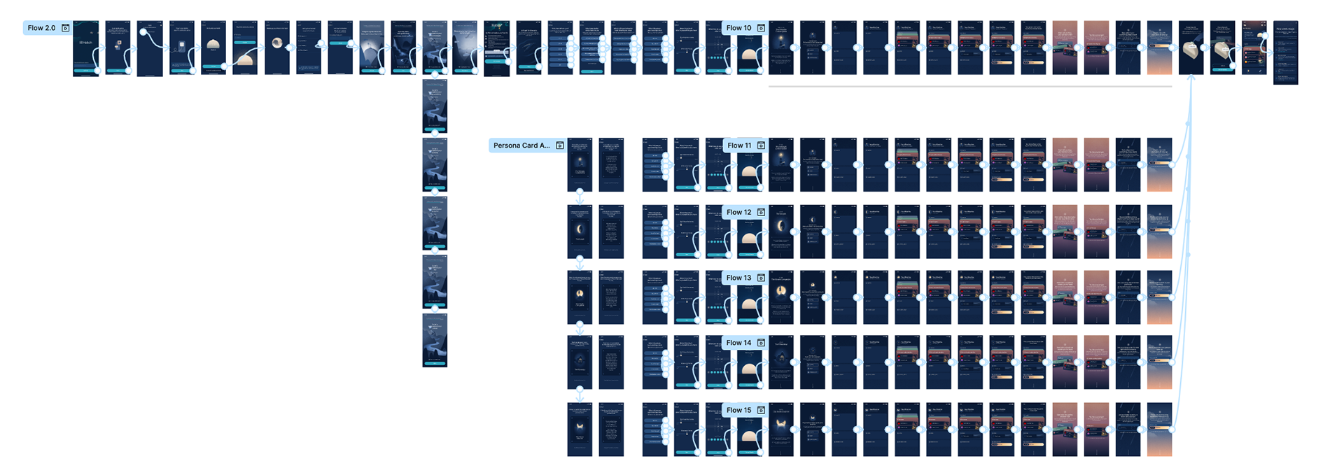
Test, Iterate and Test some more
We tested two versions of the onboarding flow with users. The first, called the “Maximal flow,” was a full walkthrough that introduced all of Restore 3’s core features. The second, the “Minimal flow,” focused on helping users set up their persona and first routine, with just enough hardware guidance to get started.
We ran two rounds of testing. The first was a dogfooding session with our internal testers, who followed a structured script and helped us surface key bugs and usability issues. The second was a live beta with real users, where we ran a multi-week diary study with interviews at the beginning and end. Across both rounds, the Minimal flow clearly performed better. It validated our decision to simplify the experience and lean into progressive onboarding over time.
Based on testing and feedback from our leadership team, we shifted the onboarding from an information-heavy experience to one focused on outcomes. Through intentional copy changes, we moved away from an instructional tone and instead aimed to inspire. The new flow highlighted user goals across key moments in the journey, with most of the changes showing up in the persona quiz and routine setup where we emphasized personal benefits over features.
What We Learned
We saw promising early indicators that the new onboarding experience was making an impact. Abandonment rates dropped by approximately 28% compared to Restore 2, and around 77% of users completed setup in a single session. Users also engaged meaningfully with their assigned personas — in follow-up interviews, nearly half of participants mentioned their persona without prompting and used it to guide how they approached their nightly routine.
That said, there were still clear areas for improvement. Roughly 56% of users reported confusion around unwind routines, and another 32% struggled to understand the new hardware buttons. Much of this stemmed from the added complexity of the updated product and app experience. In response, we launched a focused effort to reduce friction and clarify functionality through what we called the Project Simplify Audit.