Problem
After launch, we received a surge of customer support complaints indicating that both the app and Restore 3 hardware felt overly complicated and difficult to use. Since the app had evolved over multiple product cycles, some parts of the experience felt outdated or misaligned with the new device. Other areas were simply too complex for users to navigate confidently. To better understand where users were getting stuck, we conducted a simplification audit to identify the most critical pain points and develop clear recommendations to streamline the experience.
Feedback & Research
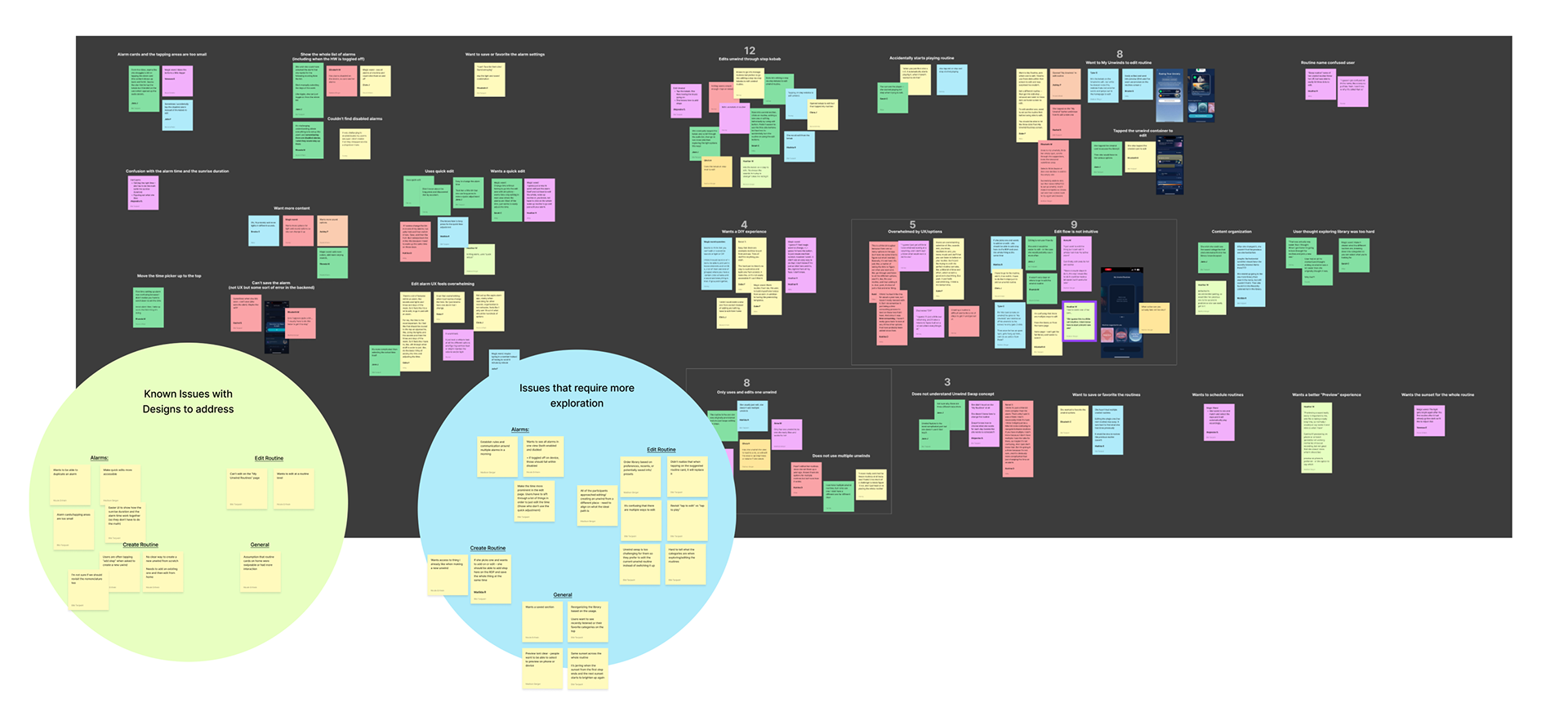
We reviewed a high volume of customer support tickets that surfaced after launch. While the volume was expected for a new product, many of the tickets lacked detail, which made it difficult to pinpoint exact friction points. Still, they served as a strong signal that users were struggling and helped us identify recurring themes worth investigating.
In parallel, we conducted a usability study to better understand how users were interacting with these features, particularly how they were editing their alarms and unwinds. This gave us a clearer, first-hand view of where users were getting stuck and why. It also helped us organize our findings into two groups: known issues we could act on immediately, and areas that required deeper exploration and follow-up research.
The Audit
The customer support feedback and research helped us focus the audit on three key areas of the experience: the homepage, unwind routines, and the alarm. These surfaced as the most common sources of confusion and friction. The artifact below captures the outcome of that audit. We used a journey map to highlight where users were running into issues, annotated specific observations directly on relevant screens, and outlined targeted recommendations beneath each section to address those problem areas.

Principles
I defined a set of core principles to evaluate the focal areas against:
1. Organize information with a clear hierarchy
Organize content with a clear hierarchy. Important information should stand out and be easily accessible, while less crucial details should be appropriately prioritized.
Organize content with a clear hierarchy. Important information should stand out and be easily accessible, while less crucial details should be appropriately prioritized.
2. Give users a clear primary job/ Minimize choices
When presenting options or actions, limit choices to prevent decision fatigue. This could involve categorizing products or services and guiding users through fewer, more relevant options.
When presenting options or actions, limit choices to prevent decision fatigue. This could involve categorizing products or services and guiding users through fewer, more relevant options.
3. Clear nomenclature aka speak human
Use plain and user-friendly language in all user interface elements, including labels, instructions, and error messages. Avoid jargon and technical terms to ensure content is easily understood by a wide range of users, adhering to best practices of UX writing.
Use plain and user-friendly language in all user interface elements, including labels, instructions, and error messages. Avoid jargon and technical terms to ensure content is easily understood by a wide range of users, adhering to best practices of UX writing.
4. Simplify and clarify pages
Simplify user flows, define clear page objectives, and minimize visual distractions for a more intuitive and straightforward experience.
Simplify user flows, define clear page objectives, and minimize visual distractions for a more intuitive and straightforward experience.
Homepage
On the homepage, users often felt overwhelmed by the sheer amount of options and information presented. I identified two top-level issues that required immediate attention: Unclear hierarchy and visual clutter.
1. Unclear Hierarchy
Top level headers like “Unwind” are overpowered by larger headers such as the unwind routine header “Chill Vibes” which should be nested within the Unwind. This breaks hierarchical structure and leads to confusion as to what information is the most important.
Recommendation:
Establish clear hierarchical standards for headers, sub-headers and tertiary headers and containers.

2. Visual Clutter
There is a lot of information being presented to the user on the homepage, from multiple routines, to different UI elements, to information about the content. This creates a lot of noise for the user to decipher in order to understand each element in addition to what we are asking them to do.
Recommendation:
Prioritize which UI elements are critical to the experience and remove unnecessary elements.

Home explorations
Here are a few revised concepts for the homepage. Some of the key updates included:
■ Reducing and simplifying containers to minimize visual clutter
■ Introducing a carousel to make the unwind swap interaction more intuitive
■ Removing kebab menus that added unnecessary complexity
Here are a few revised concepts for the homepage. Some of the key updates included:
■ Reducing and simplifying containers to minimize visual clutter
■ Introducing a carousel to make the unwind swap interaction more intuitive
■ Removing kebab menus that added unnecessary complexity
■ Introduce play icon for a clear action
■ Streamlined headers for better readability
■ In the second screen, we tested moving alarms above the fold, since data showed they were the most frequently accessed feature
■ Streamlined headers for better readability
■ In the second screen, we tested moving alarms above the fold, since data showed they were the most frequently accessed feature

Unwinds
Users are often guessing at how to edit an Unwind and using multiple taps in different parts of the app in order to edit their routine.
1. Hierarchy/Primary Job- Edit Kebabs
With the edit step kebabs present at the routine level, users are given access to an action that should be contained within the unwind edit flow. This leads to too many actions being available to the user on the homepage and confusion as to what their primary job is.
Recommendation:
Consider moving this one level deeper into the manage my routines flow
2. Unclear Action- Play
Tapping the step to play is an unmarked affordance. When a user taps a step it is unclear that it will start playing the step on device, leading to unexpected plays, confusion and/or frustration.
Recommendation:
Clearly define tap areas with correct affordances (eg: play icon) and limit to one action.

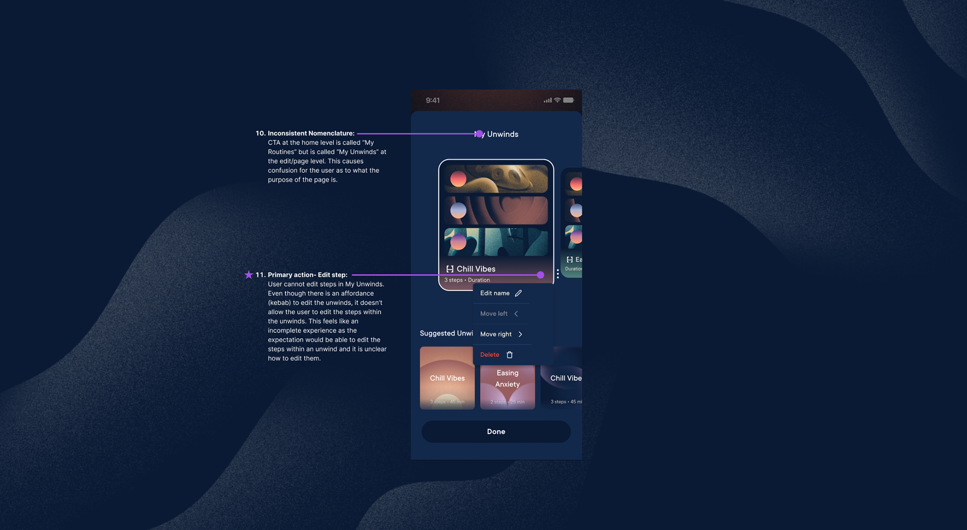
3. Primary Action- Edit Step
User cannot edit steps in My Unwinds. Even though there is an affordance (kebab) to edit the unwinds, it doesn’t allow the user to edit the steps within the unwinds. This feels like an incomplete experience as the expectation would be able to edit the steps within an unwind and it is unclear how to edit them.
Recommendation:
Introduce edit capabilities at the My unwinds/My routine level.
Unwind Explorations
Here are early explorations for a new flow for the Unwinds.
■ Kebabs to edit the entire routine are presented at the top level, while kebab at the step level have been removed to reduce complexity and clutter.
■ Once in the edit routine view, kebabs for the step view appear to allow users to manage their unwind routines.

Alarms
Users are having to tap into the edit page to edit alarms which can be cumbersome and time consuming when done frequently.
1. Unclear Action- Tap to Edit
Tapping the respective alarm expands the alarm to reveal the content name. This does not help the user with their primary action of editing their alarm and is inconsistent with the way other steps behave and may lead to user frustration in the inability to complete the desired action.
Recommendation:
Have taps take user to primary action of edit- whether an edit screen or edit in-line.
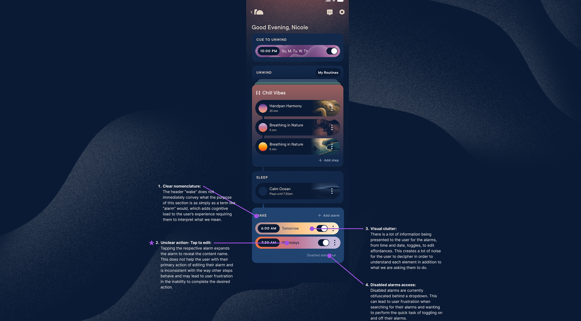
2. Improper Hierarchy
Time is located below the fold of the edit page. The primary action of the edit alarm page should be to edit the time and relevant functions. By being positioned so far below the fold and not as a top primary action, users are forced to scroll down each time they want to edit the time of their alarm.
Recommendation:
Move time and associated actions to the top as it is the function users need to interact with the most.

Alarm Explorations
Here are two core updates we made to the alarm experience based on the audit:
■ Moved the alarm time higher on the screen to make it immediately visible and reduce the need to scroll
■ Introduced tap-to-edit interaction at the home page level for easier alarm adjustments without opening a separate detail view

What's next?
We began mapping the top recommendations onto an impact and effort graph to prioritize what to tackle first. I partnered with crossfunctional teams to help evaluate and plot each opportunity. Incremental work is already underway, and we expect to see measurable results soon. As part of this effort, the design team held a focused design jam to rapidly explore solutions, specifically around the question of how we might simplify the routine homepage. The goal is to refine the strongest concepts from that session and begin integrating them into the upcoming roadmap.

