
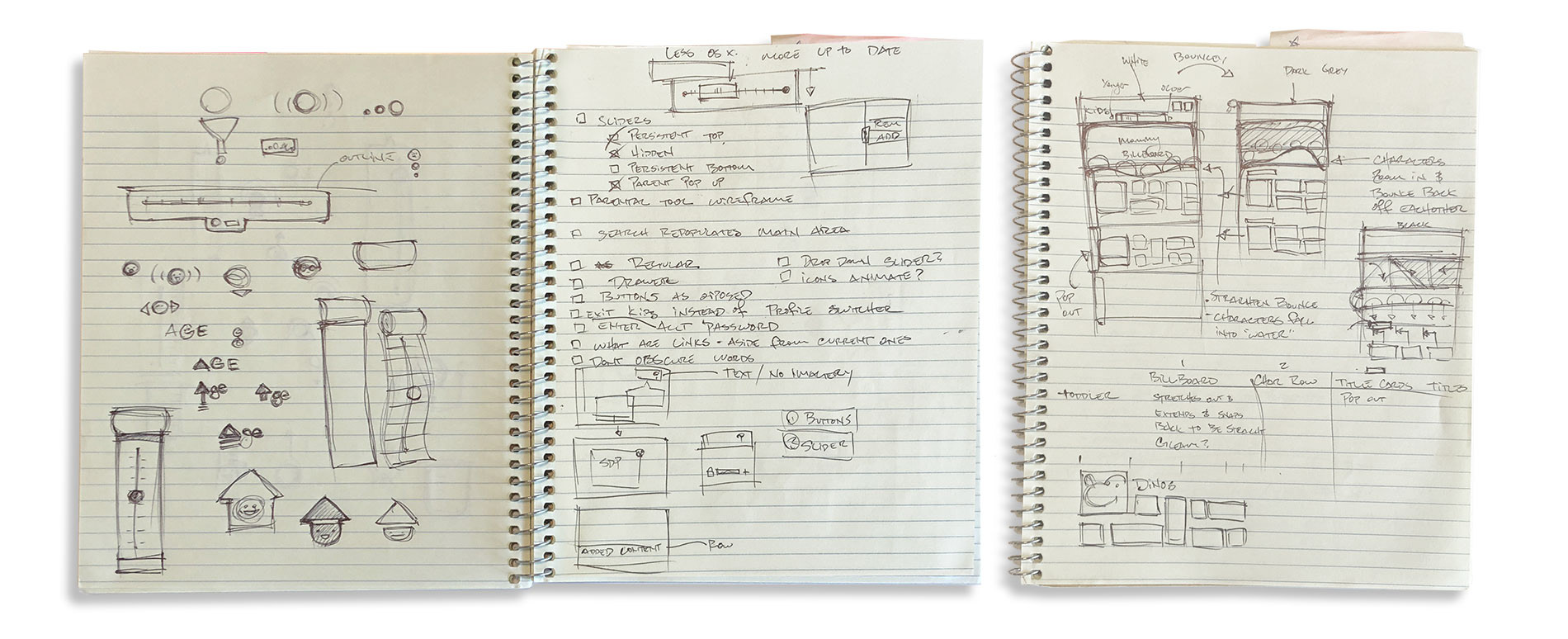
Ideation
In order to give kids a sense of control over the UI and their content, we focused on several key elements that we felt would get the best read for this test:
■ Slider: A slider would allow kids to control which age range experience they were seeing.
■ Transitions: Transitions in the UI between the different age range would give kids an indicator of which experience they were in.
■ Content: We decided early on that serving content that kids are used to seeing would be a crucial part of the test. We decided that pulling data from their live profile to populate the prototype would be the best course of action.
During the sketch phase, i fleshed out several of these ideas in quick, low-cost sketches before transitioning more concrete ideas to wire frames.
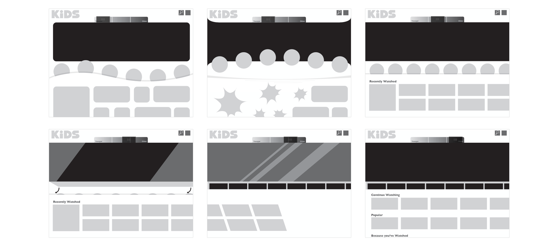
Wire Frames
During the wire framing stage, my first task was to come up with potential variations of the Kids product and what it’d look like for each different age range: Preschool, Kindergarten, Kids and Pre-Teens. I designed these wireframes as an animatic storyboard to show the possible transitions that the interface could take as a child moved the slider from left to right.
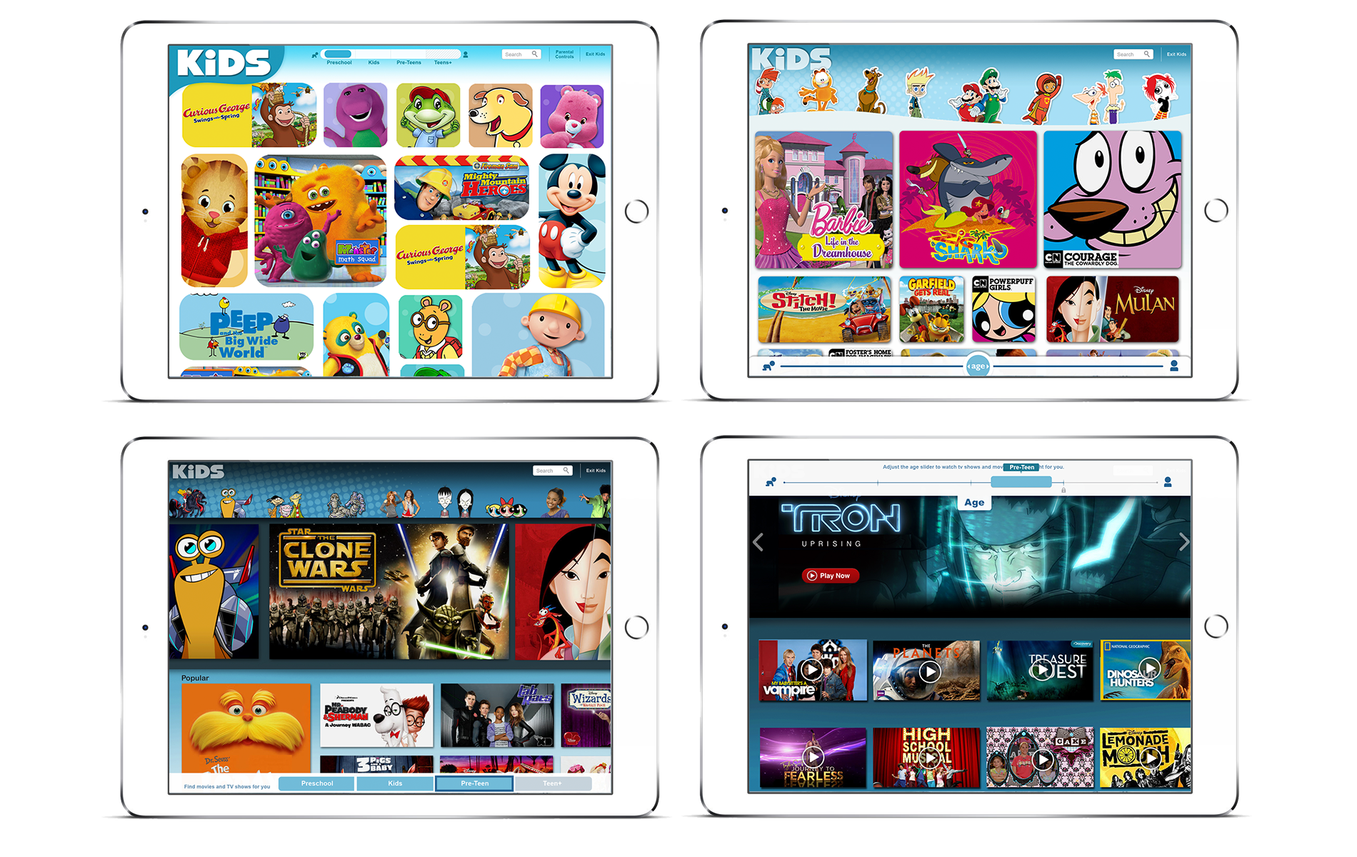
Mockups & Prototyping
The next phase of mockups was extensive as I explored multiple designs for each of the age ranges. Once the visual elements were designed I worked closely with a prototyper to implement the design in a fully functional prototype. We went to extremes to ensure the prototype was as polished as possible, as we wanted to ensure the kids weren’t distracted by the prototype and provide the illusion that this was already a feature implemented by Netflix.
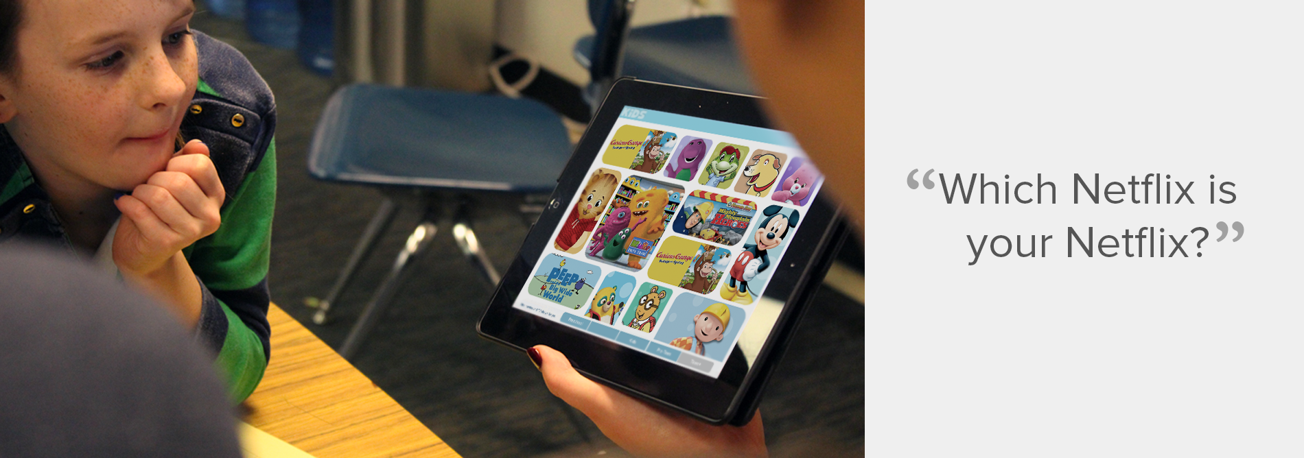
Testing
Testing of the prototype was conducted at 2 separate locations over the course of 4 days, with 12 kids per day. The kids ranged from ages 4 to 12 years old. The user researcher worked closely with the kids and asked them to perform tasks such as “Find your favorite show.” Or asked questions such as “Which Netflix is your Netflix?” and “Can you tell if this version is for you or for mommy or daddy?” In testing we looked primarily for:
■ Discoverability of the slider
■ Comprehension of what the slider controlled
■ Whether the child felt this version of Netflix was appropriate for them or not
■ Differentiation in content
Key Insights and Conclusion
Some of the key insights that we took away from the test were:
■ Kids were more distracted than aided by the slider and transitions
■ Few kids were able to immediately grasp the concept of the slider and finding age appropriate content. Younger kids especially didn't understand what the slider was for.
■ Content was king in determining which “Netflix was their Netflix.”
■ Younger kids were far more likely to use the character bar to find shows while older kids would actually take the time to peruse titles before making a selection.
■ We likely could’ve discovered the same results with a less polished and less expensive version of the prototype.
While the tests ultimately weren’t successful in validating our hypothesis, many other key findings surfaced in this test. We decided not to move forward with the Aging Up concept, however we did use these insights to improve upon other features such as the character bar, how we displayed content, and it even influenced the design of future iterations of the kids tablet experience.